
Show it in action.
I developed a 30-second App Store preview built around real product workflows, concise benefit statements, and voiceover. The sequence moves through investing, options strategies, price alerts, portfolio monitoring, market news, and built-in education before closing with the customer offer.
The objective was to make a feature-rich brokerage app feel approachable while giving prospective customers a clear view of what they could actually do inside it.
Original 30-second vertical promo · Select play to watch with voiceover.
30-second App Store preview · Original video
Clarity before complexity.
The previous App Store presentation relied on promotional messaging and partial views of the interface. I conducted competitive analysis and redesigned the creative to put actual product screens at the center, pairing each one with a clear explanation of its customer value.
I led with familiar investing functions, then introduced more sophisticated capabilities such as options and margin trading. The sequence put accessibility and customer confidence first while maintaining visibility for advanced products.
Observed immediately after the App Store creative and description updates. The result reflects the combined changes, not an isolated creative-only test.
The original marketing cards play automatically in the phone at right, following an accessibility-first sequence.
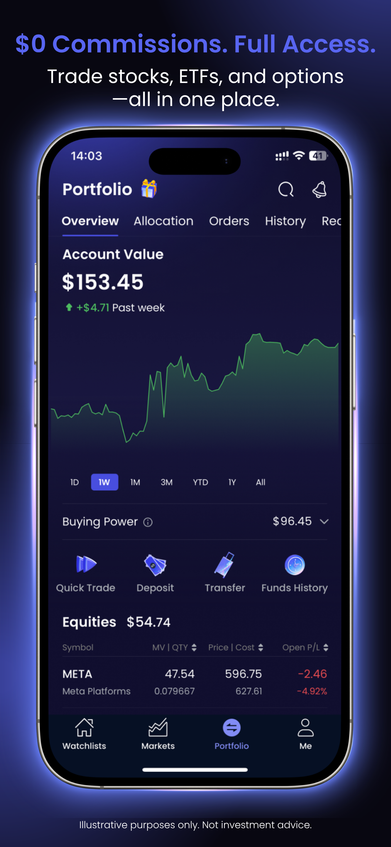
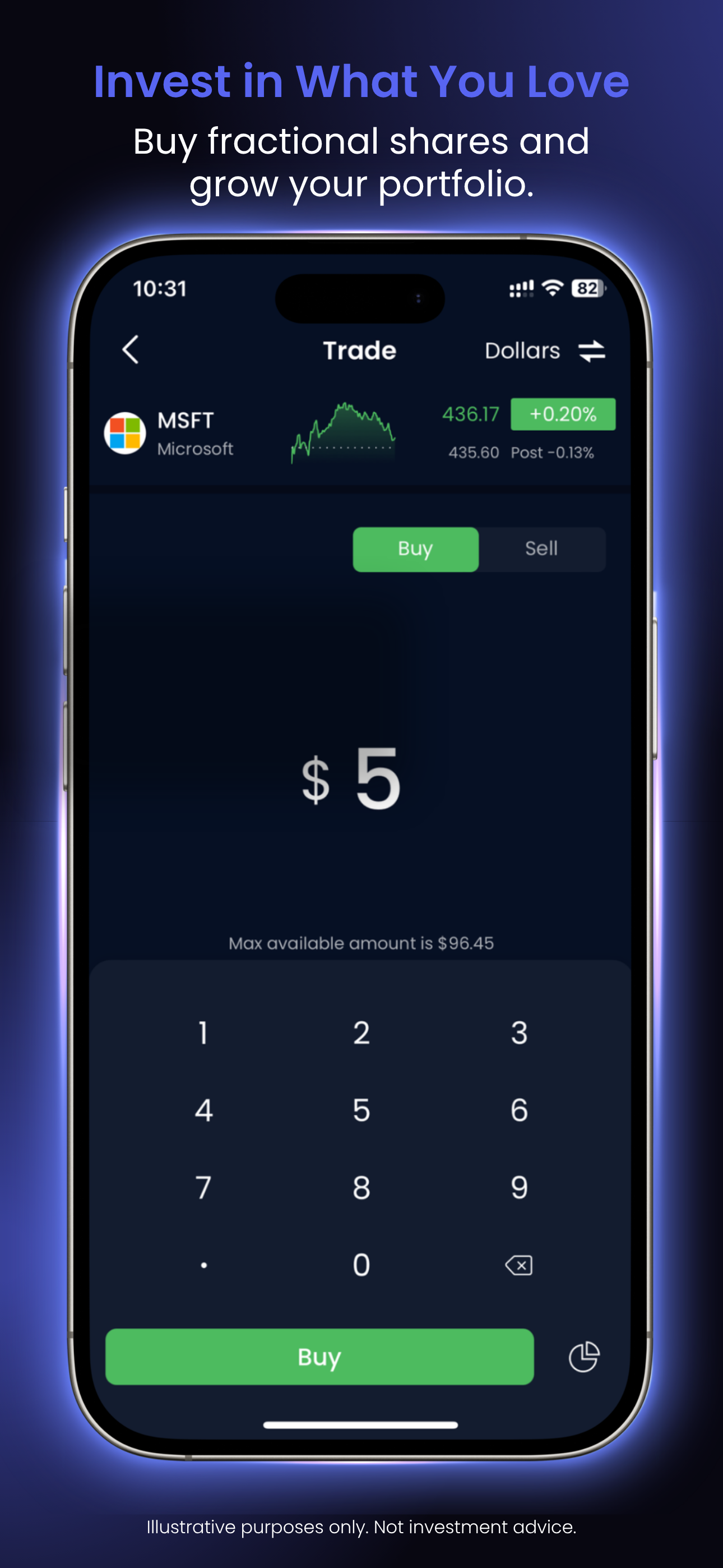
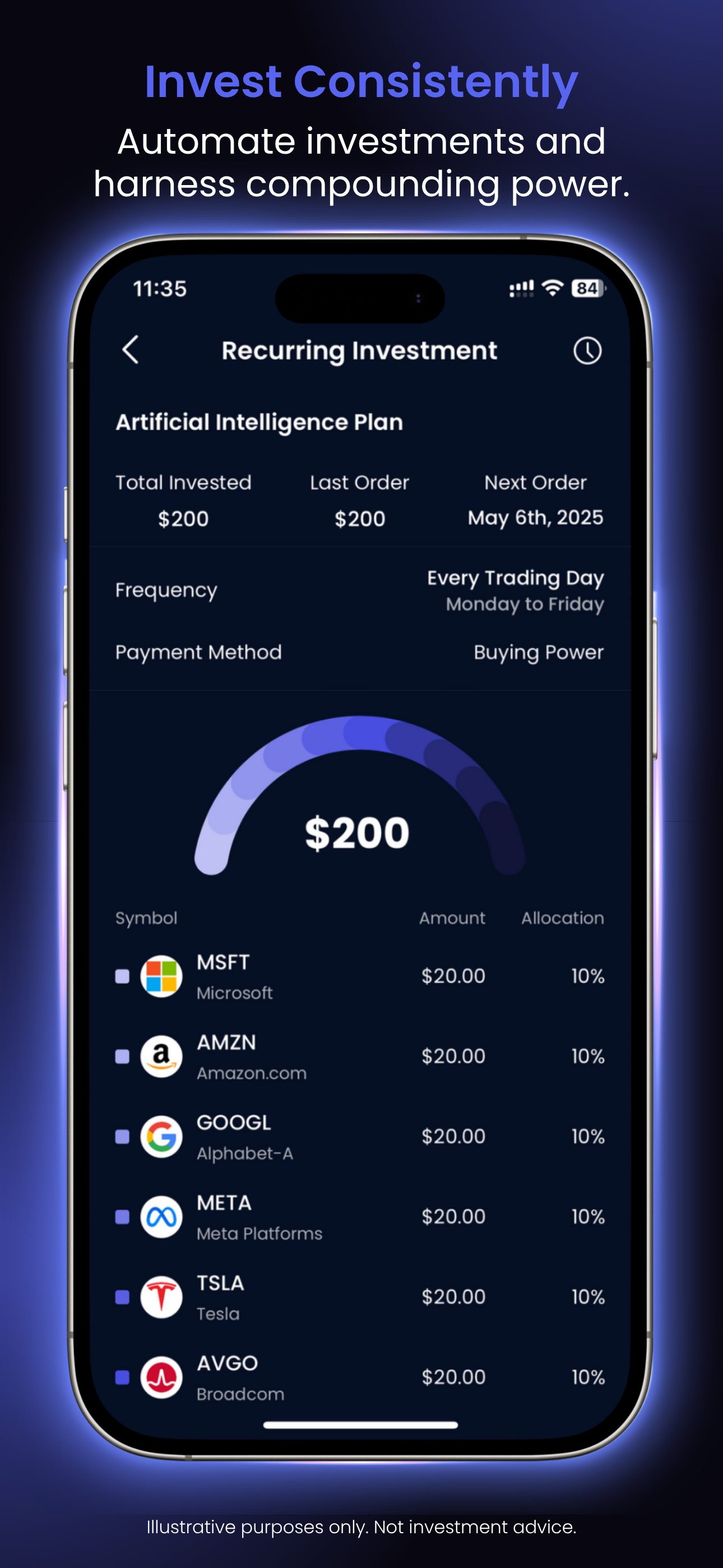
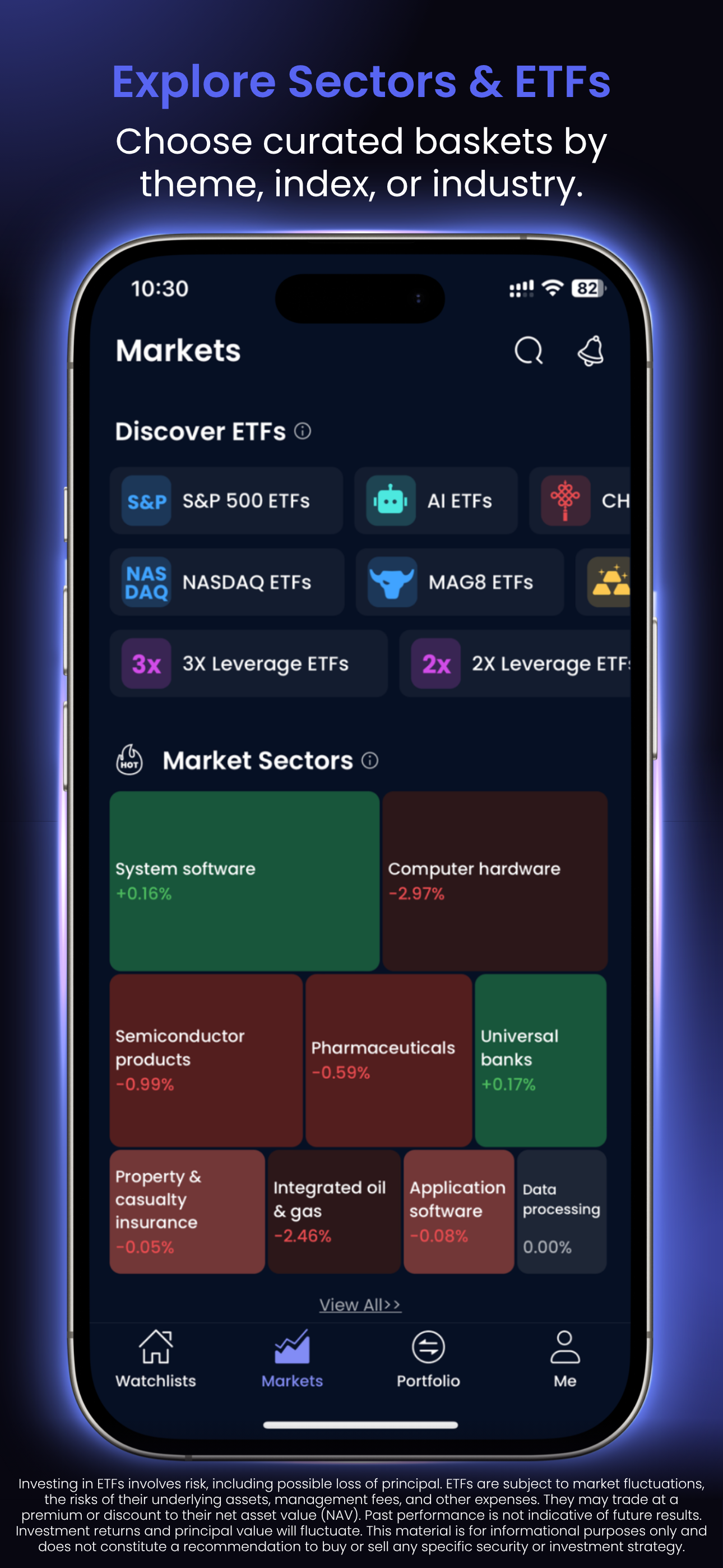
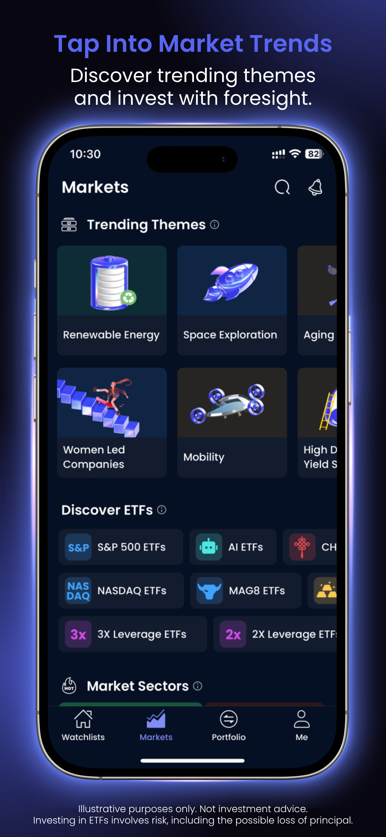
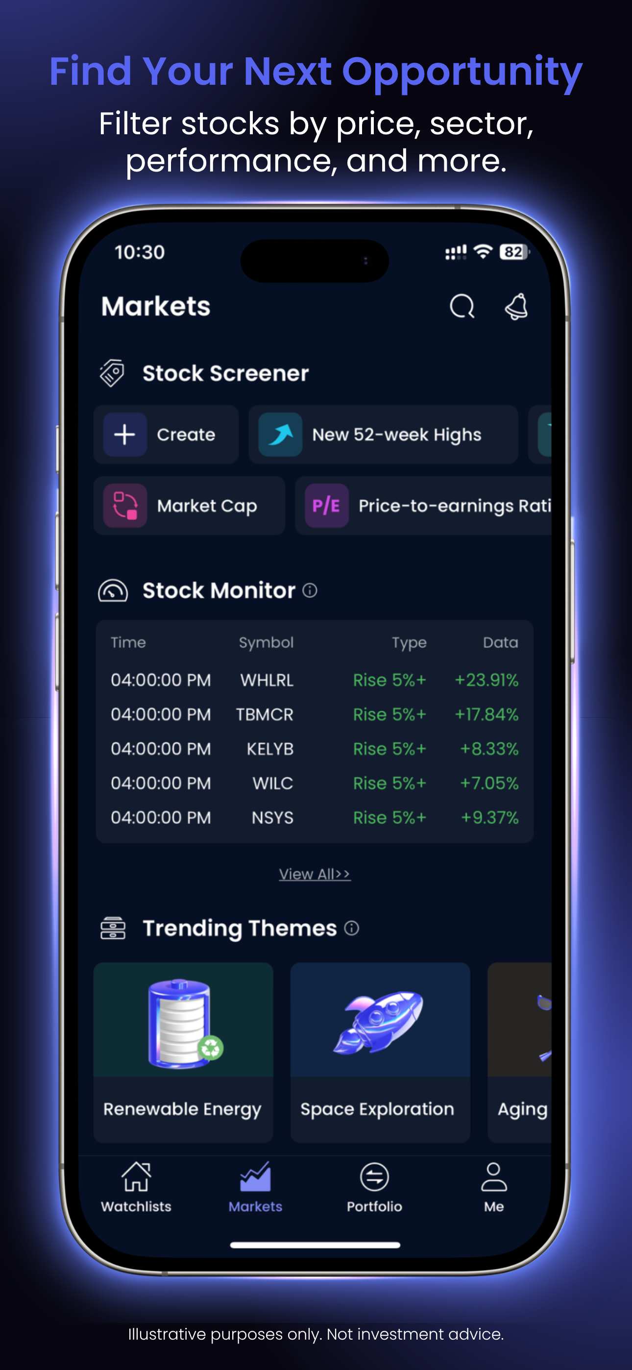
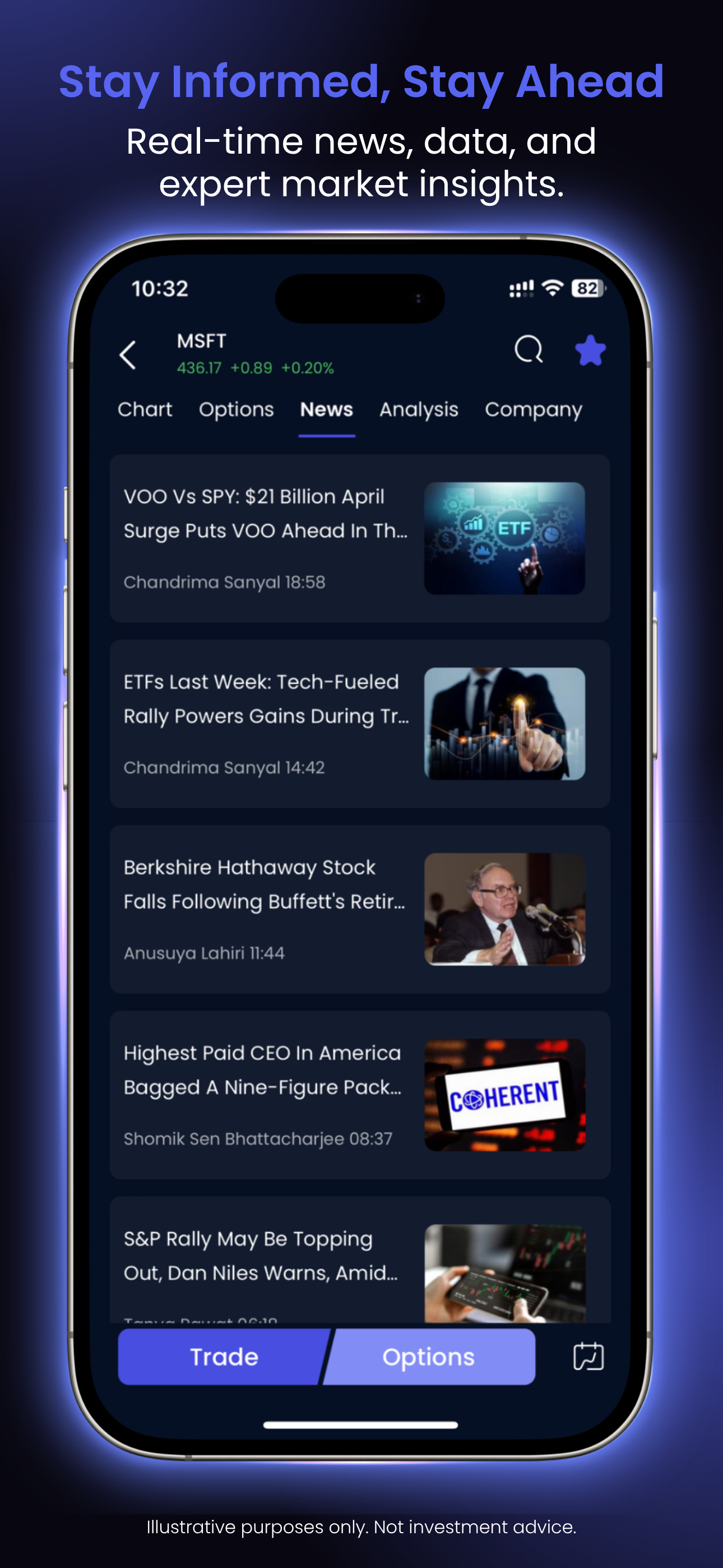
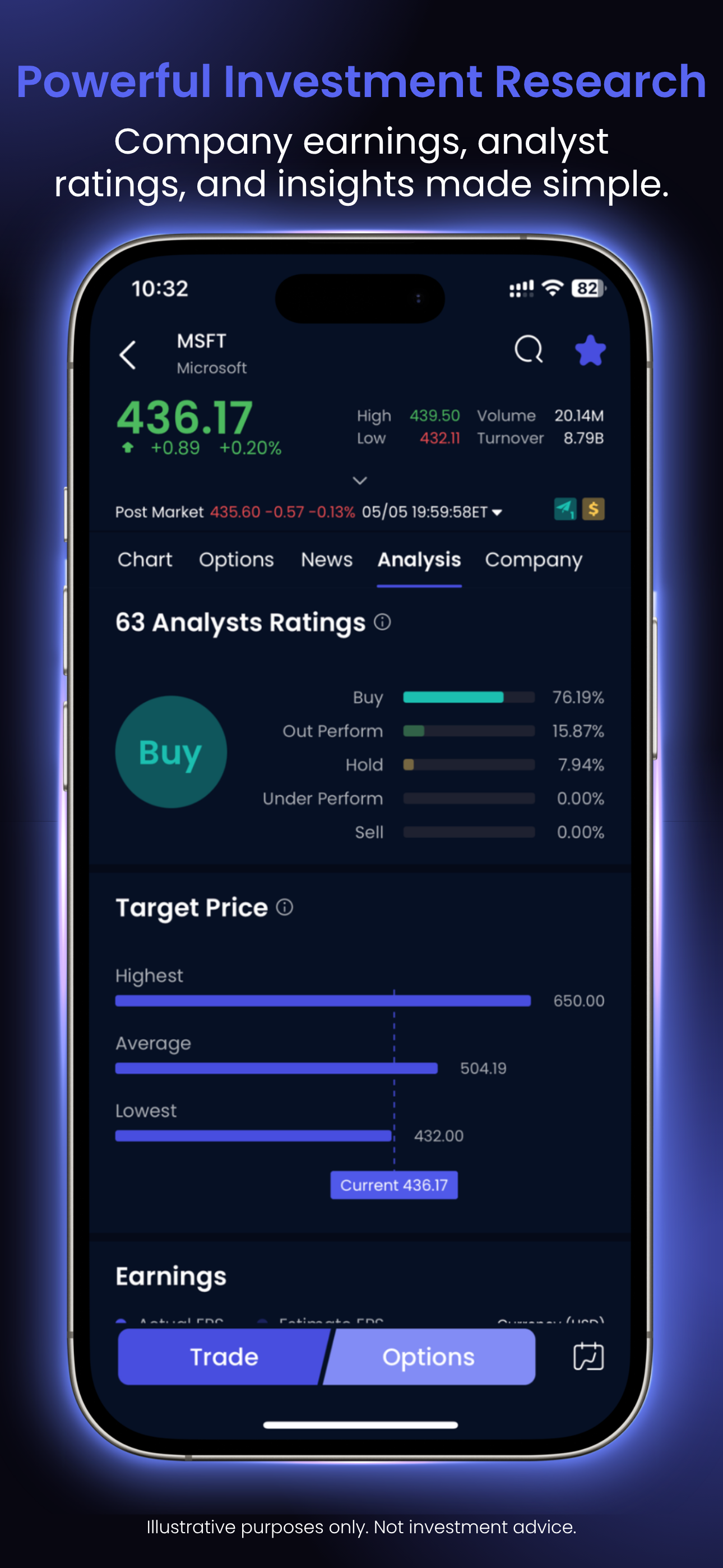
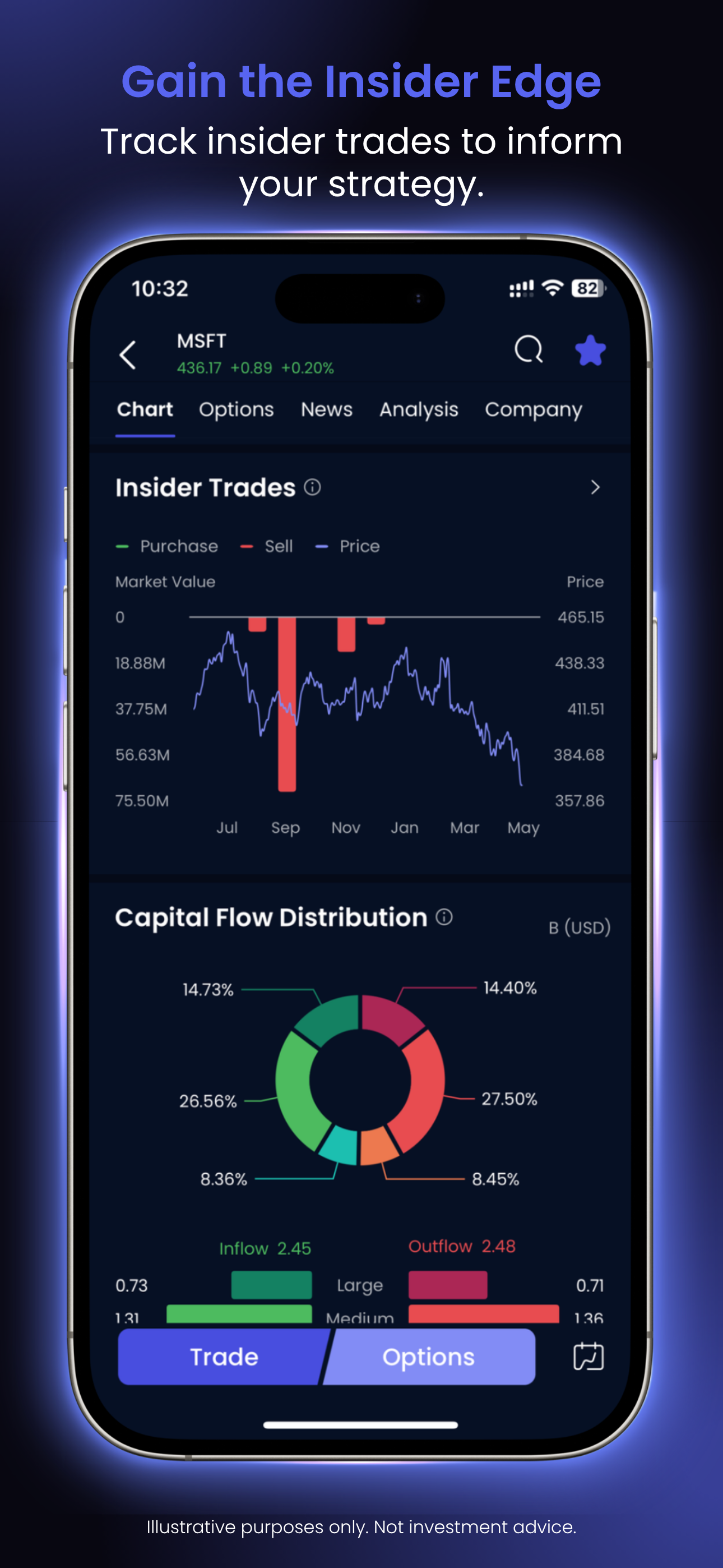
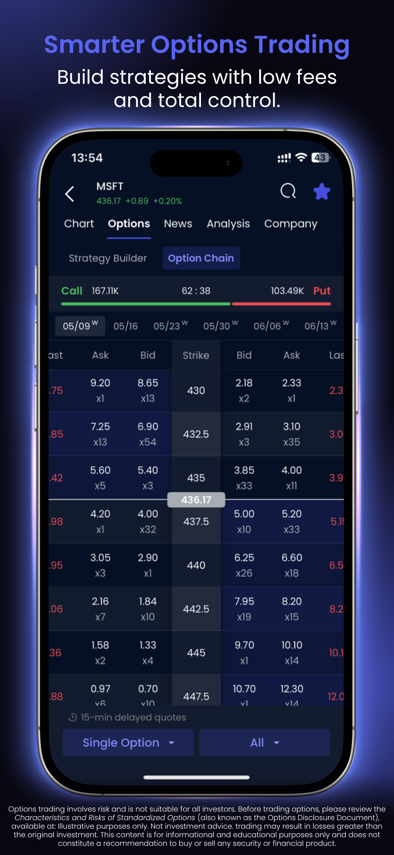
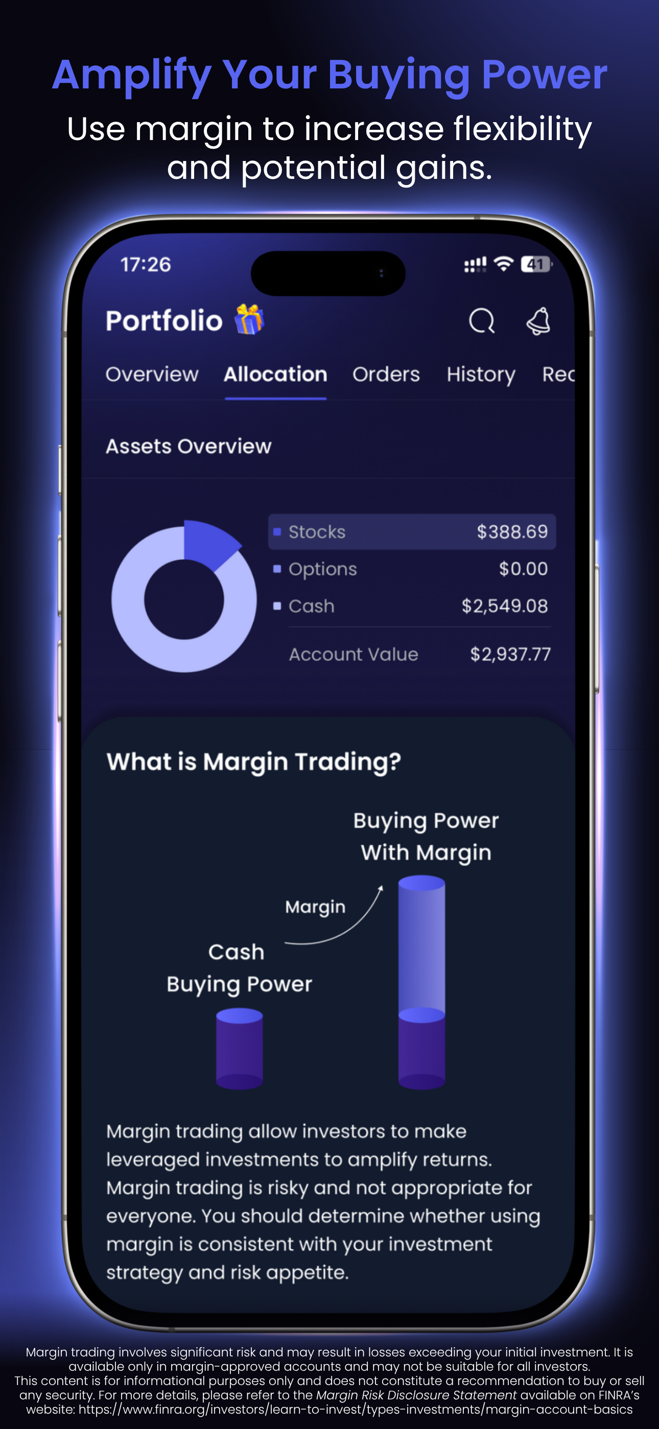
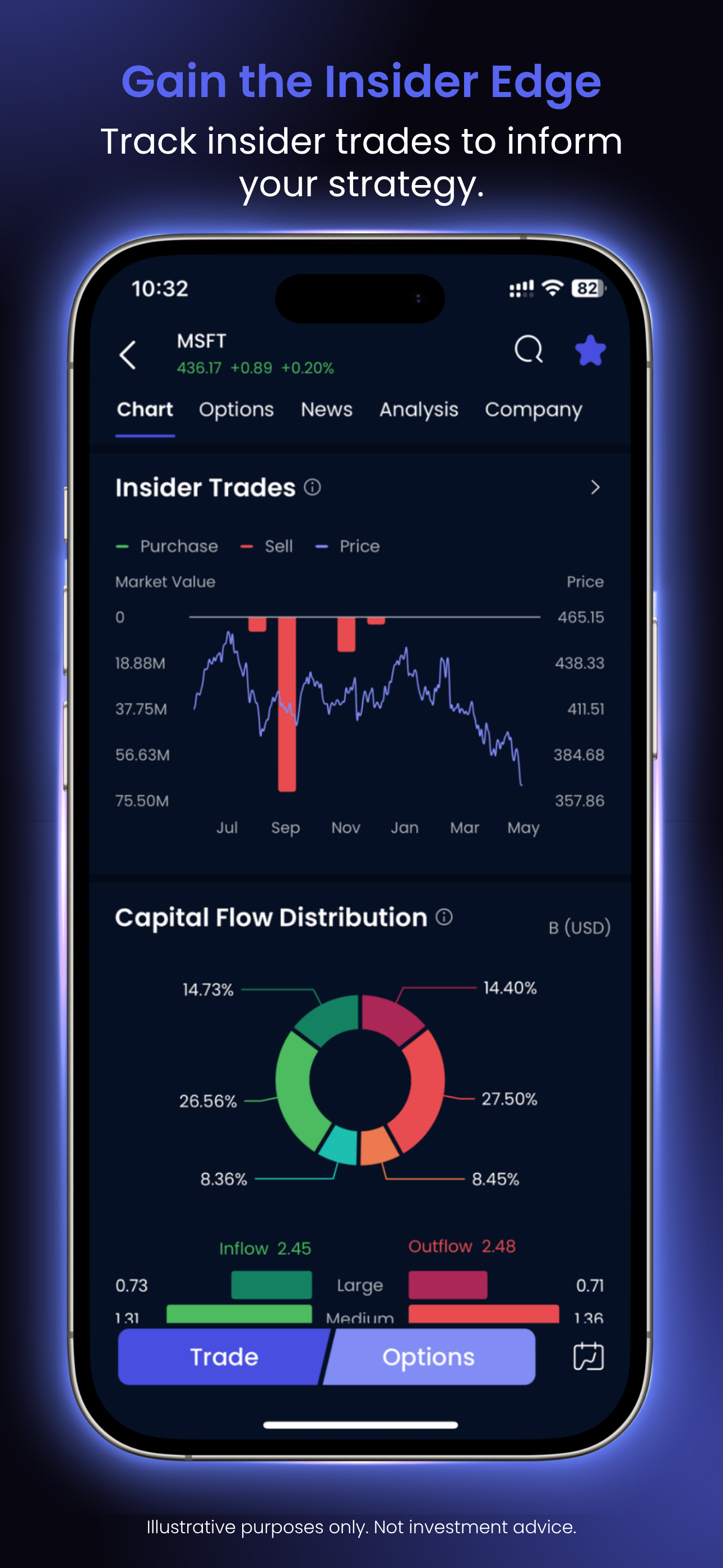
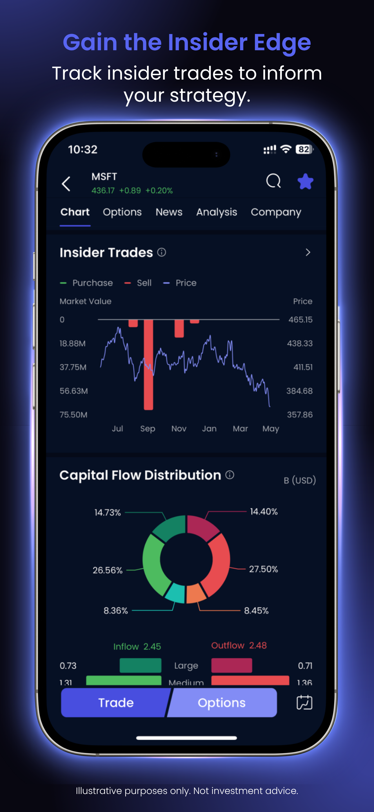
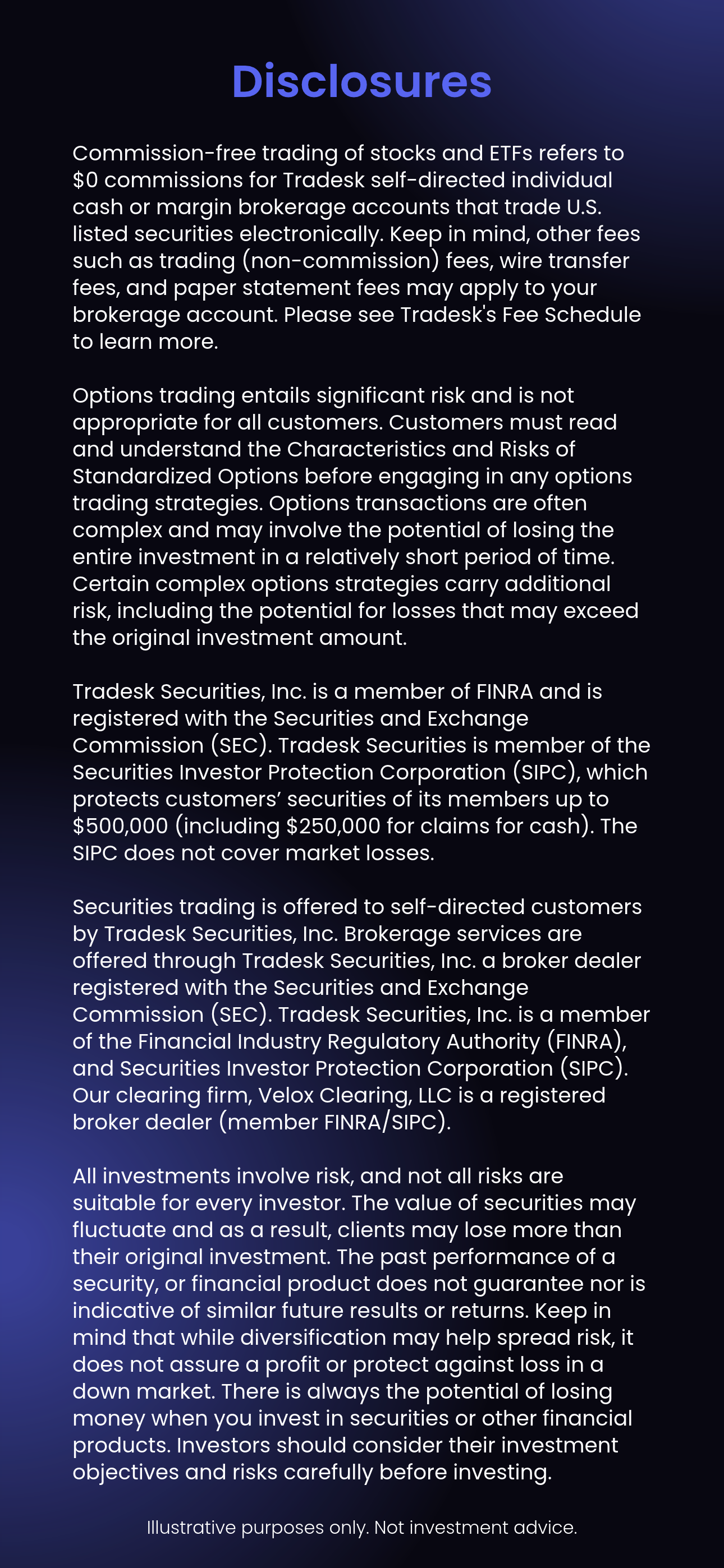
14 original App Store marketing cards · Automatic horizontal slideshow
What the category already knew.
Before redesigning the creative, I reviewed the App Store listings of leading brokerage and investing apps, including eToro, Webull, IG, TD, and Public. The strongest listings followed a consistent standard:
One feature per frame.
Each card made a single point with a short benefit headline, such as “Intuitive options trading” or “Ready-made portfolios,” instead of stacking several messages together.
The real product at the center.
Competitors showed actual interfaces (charts, order screens, research tools) so prospective customers could see what they were downloading.
Disclosures built into the creative.
eToro and Webull placed options-risk language directly on their options frames, treating compliance as part of the message rather than fine print elsewhere.
Positioning by audience.
Listings aimed at active traders, like IG and Webull, used dense, data-heavy screens built around analysis, alerts, and advanced order types. Listings aimed at newer investors, like TD and Public, led with simplicity: ready-made portfolios, Treasury ladders, and plain-language explanations.
The previous listing departed from that standard, relying on promotional messaging and partial interface views. The redesign adopted what the category had already proven, real product screens and one clear benefit per frame, while sequencing familiar investing features before advanced capabilities like options and margin to serve both audiences.
The description had to work just as hard.
I also optimized the App Store description, opening with an all-in-one investing proposition and organizing the offering into customer-facing benefits: commission-free investing, fractional shares, paper trading, real-time market data, research tools, and stock discovery. Promotional offers, advanced trading products, and required risk disclosures remained part of the message.
The result was a consistent experience between what prospective customers saw in the cards and what they read in the listing.
Explore the work behind the thinking, or continue through the strategic case studies.
View Selected Work →Ready for consequential work.
I'm interested in senior marketing leadership opportunities where strategic thinking, commercial accountability, and operational execution belong in the same conversation.